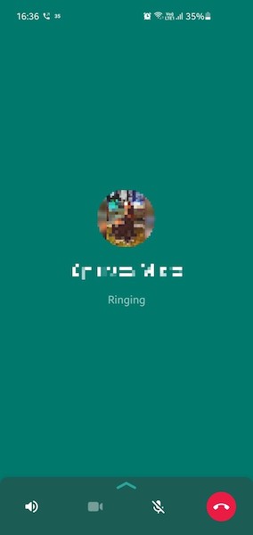
Whatsapp call interface doesn't make sense
Whatsapp changed the screen that appears when you place a call. I do not remember what the old interface looked like, but the new one is bad enough to make me notice it.
This is how it looks:

What’s wrong?
This feels wrong. It feels incomplete, like a buggy or unfinished app. The contact picture, name and the text “Ringing” is placed near the top of the screen. Following this is a huge blank space. And then a row of buttons to control the call.
The blank space seems to be waiting for some element to load. But nothing will load there, it is designed like this.
Almost 60% of the screen is simply empty green unused space, according to my calculations.
Easy fix
Whatsapp can easily fix this. Just center the picture, name and call status vertically. I don’t know why they didn’t do this in the first place. Here is a mockup:

It’s not the best, but still much better than the actual one.